THE PROBLEM
Before doing any needfinding, my team knew we wanted to focus on young adults, particularly the issue of fulfillment.
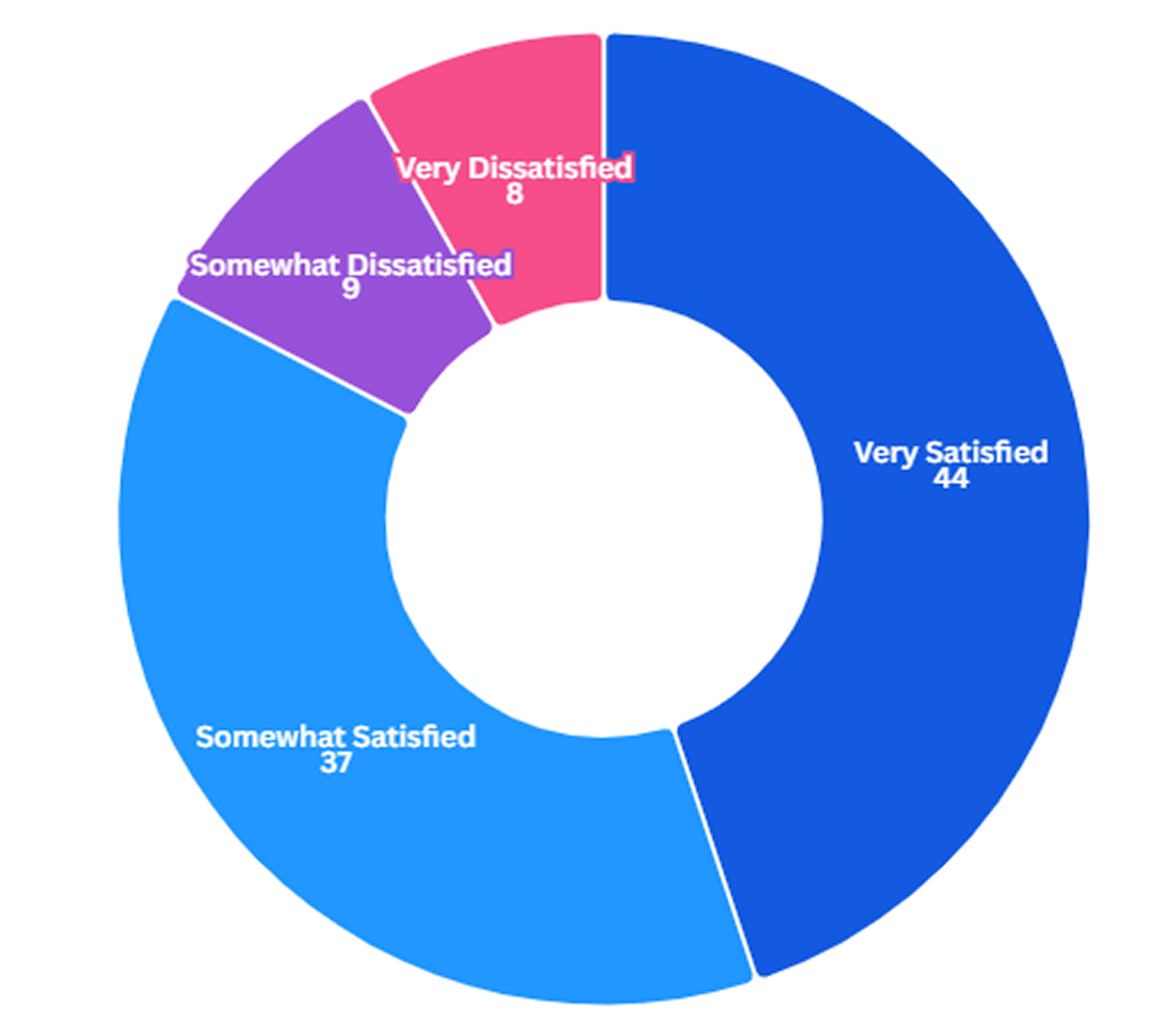
A report by Gallup in 2025 showed that 44% of Americans are “very satisfied” with their lives, which while not terrible, is an all-time low since the data started being tracked in 1979.
This satisfaction is also higher for older, higher-earning individuals, and lower for young adults.
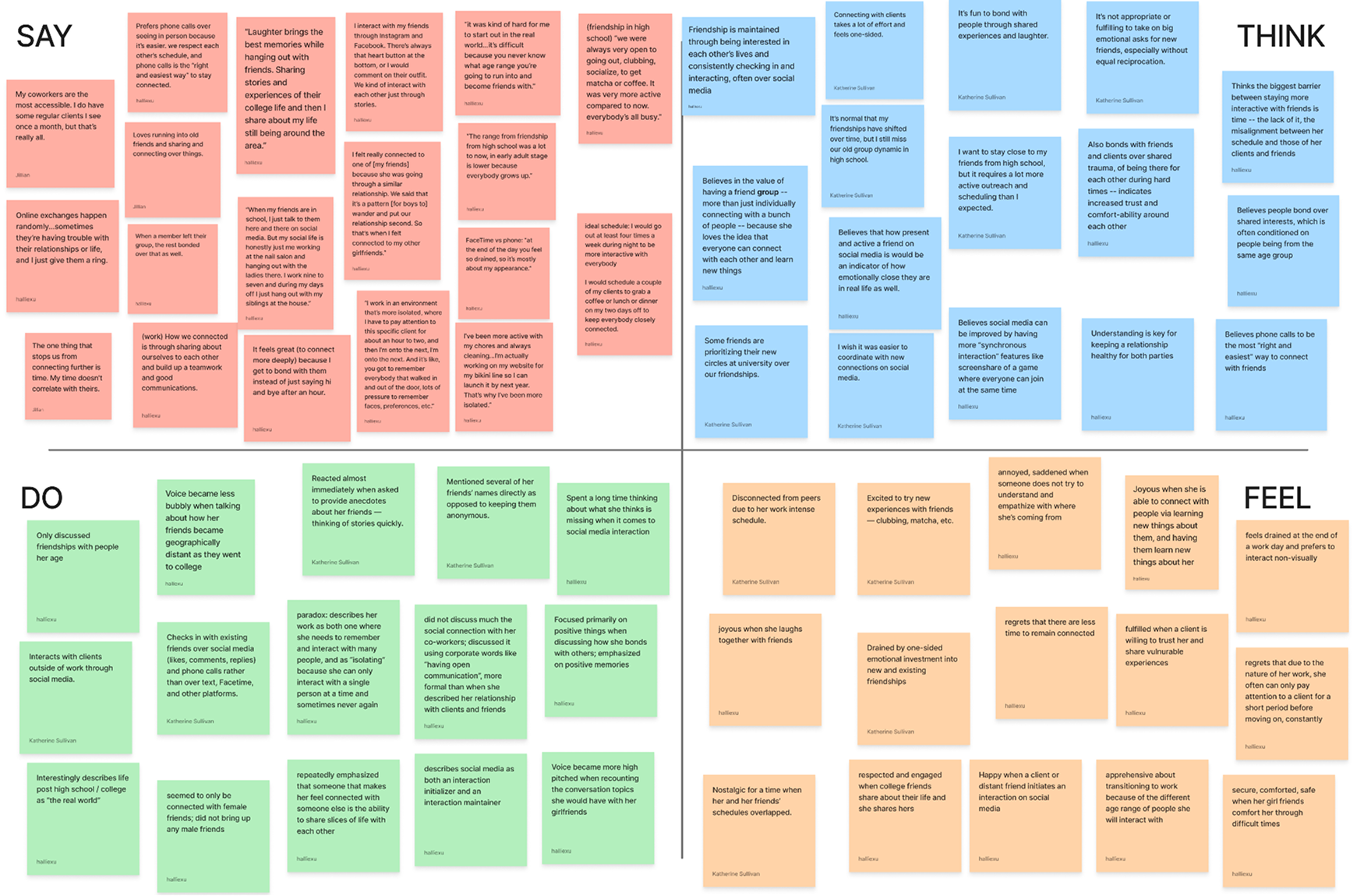
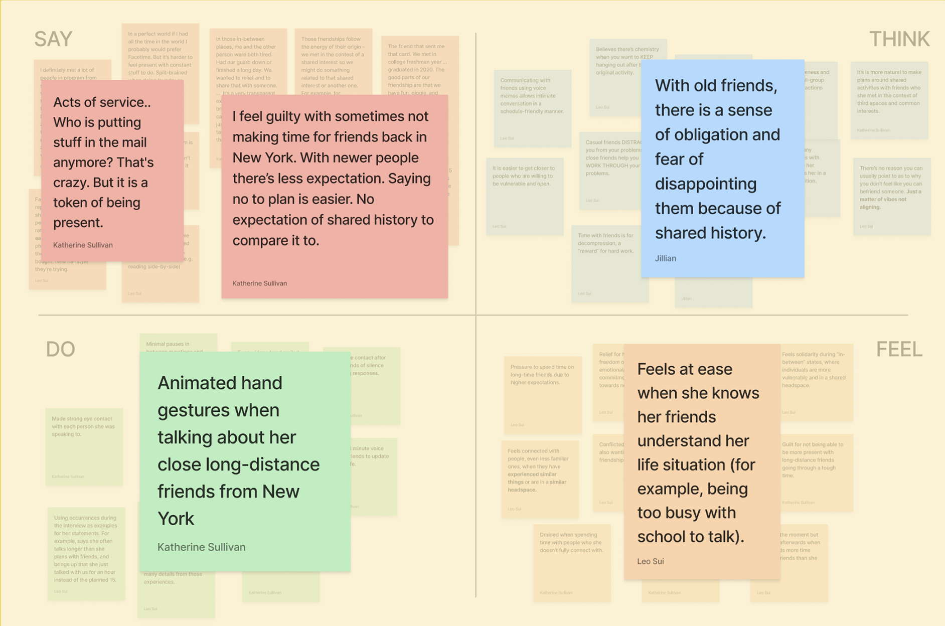
We conducted 4 interviews with young adults of varying backgrounds, making note of what they said, thought, felt, and did during our conversation. Though there were lots of interesting insights regarding creative pursuits, spreading kindness, and personal values, the quality that all interviewees highly valued for fulfillment was deep, emotionally-rich social relationships.
From there, we conducted five more interviews with young adults, centered around their experience with meaningful social relationships.
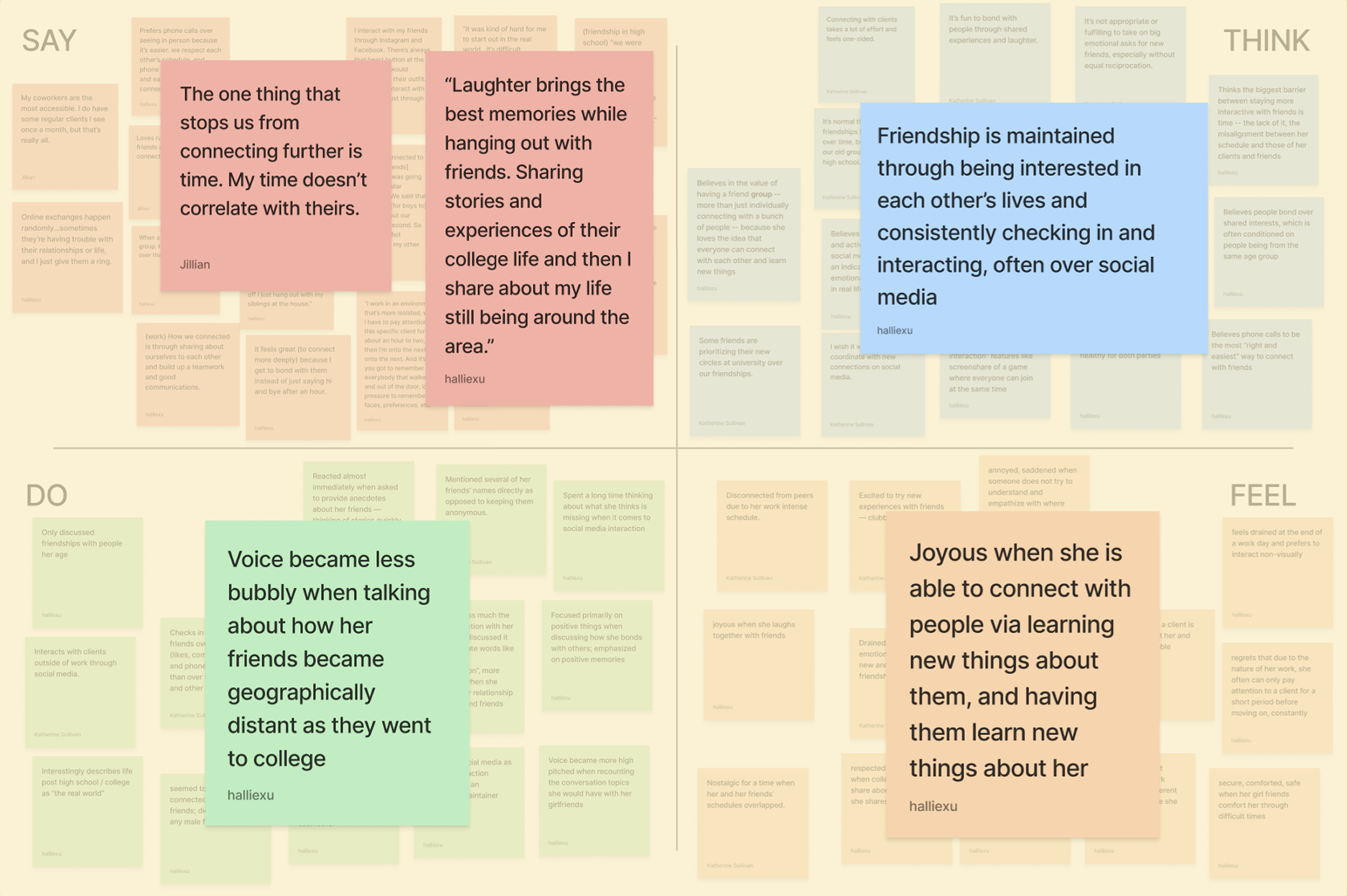
Three key insights emerged:
1.
Adulthood often introduces physical distance that reshapes existing friendships.
Participants frequently described moving for work and living farther apart from friends than before. These shifts made friendships feel more fragile and required more intentional effort to maintain.
2.
Shared experiences drive meaningful connection, but time and logistics limit them.
Interviewees expressed that shared activities, like trying something new together, laughing in person, were the moments that deepened their relationships.
3.
People value intentional, tangible moments as proof of care.
Across all interviews, the gestures that meant the most were simple but deliberate: sending a thoughtful message, initiating a plan, showing up physically, giving a small gift, or recalling a personal detail.
THE PROBLEM
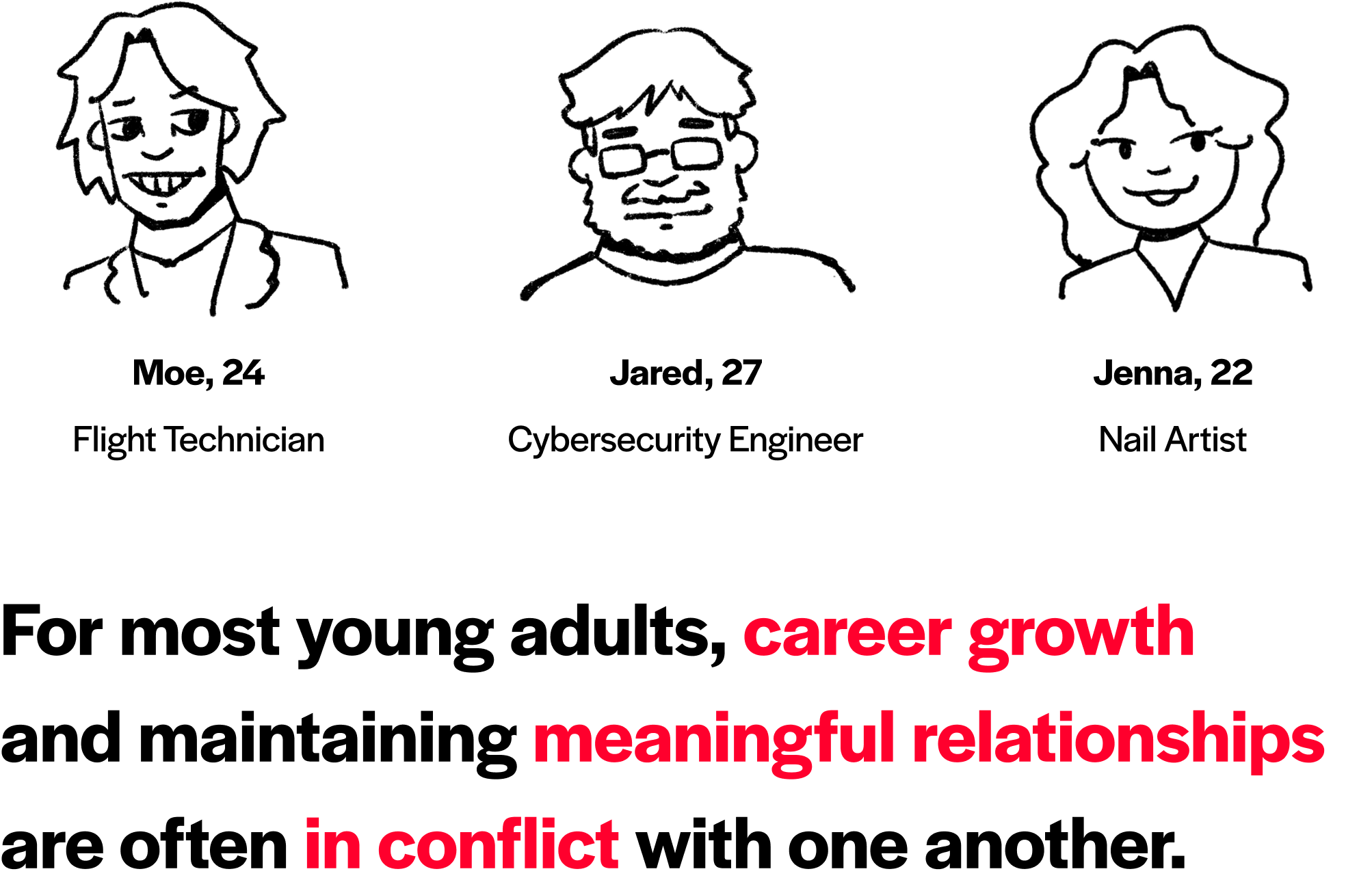
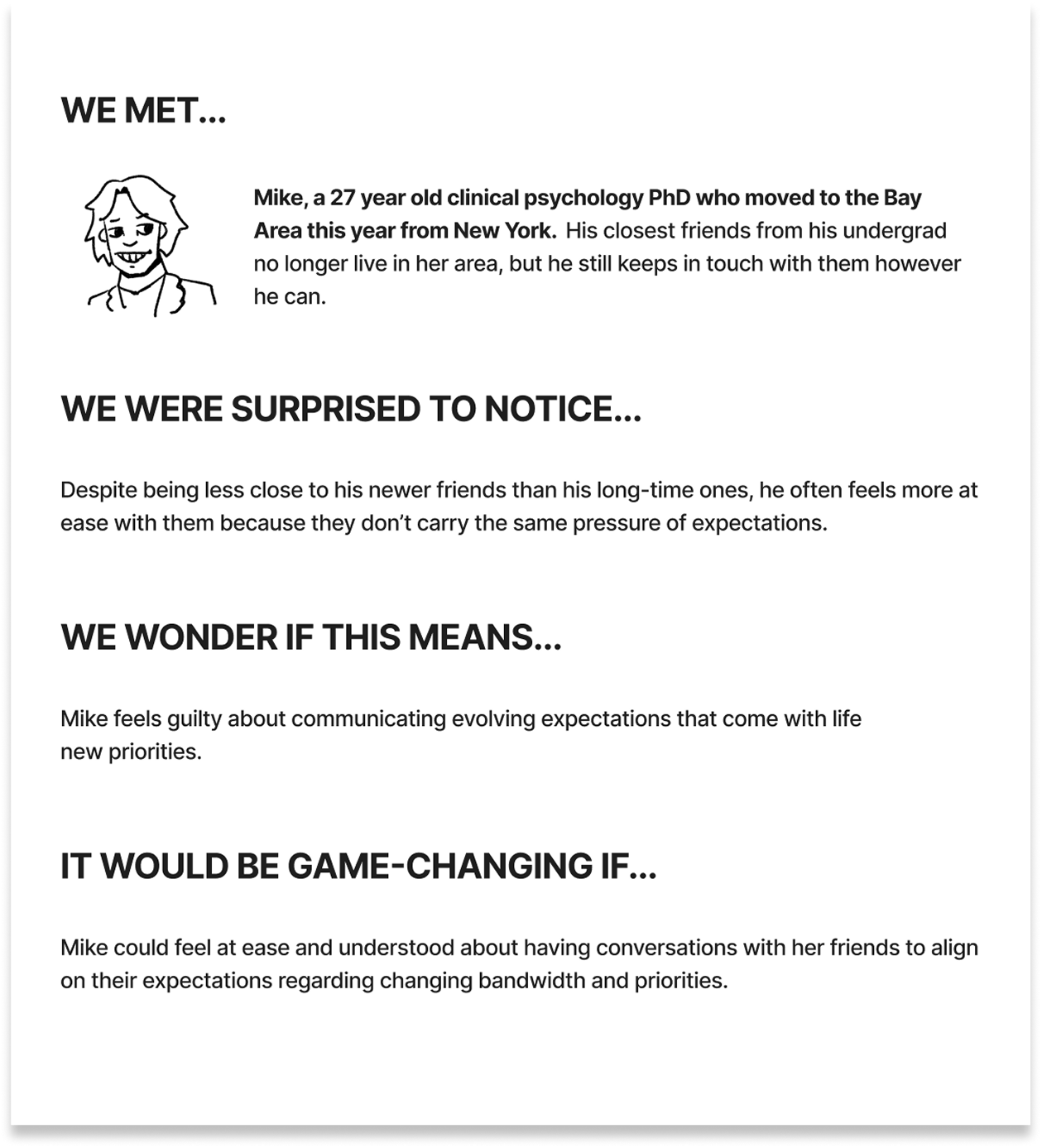
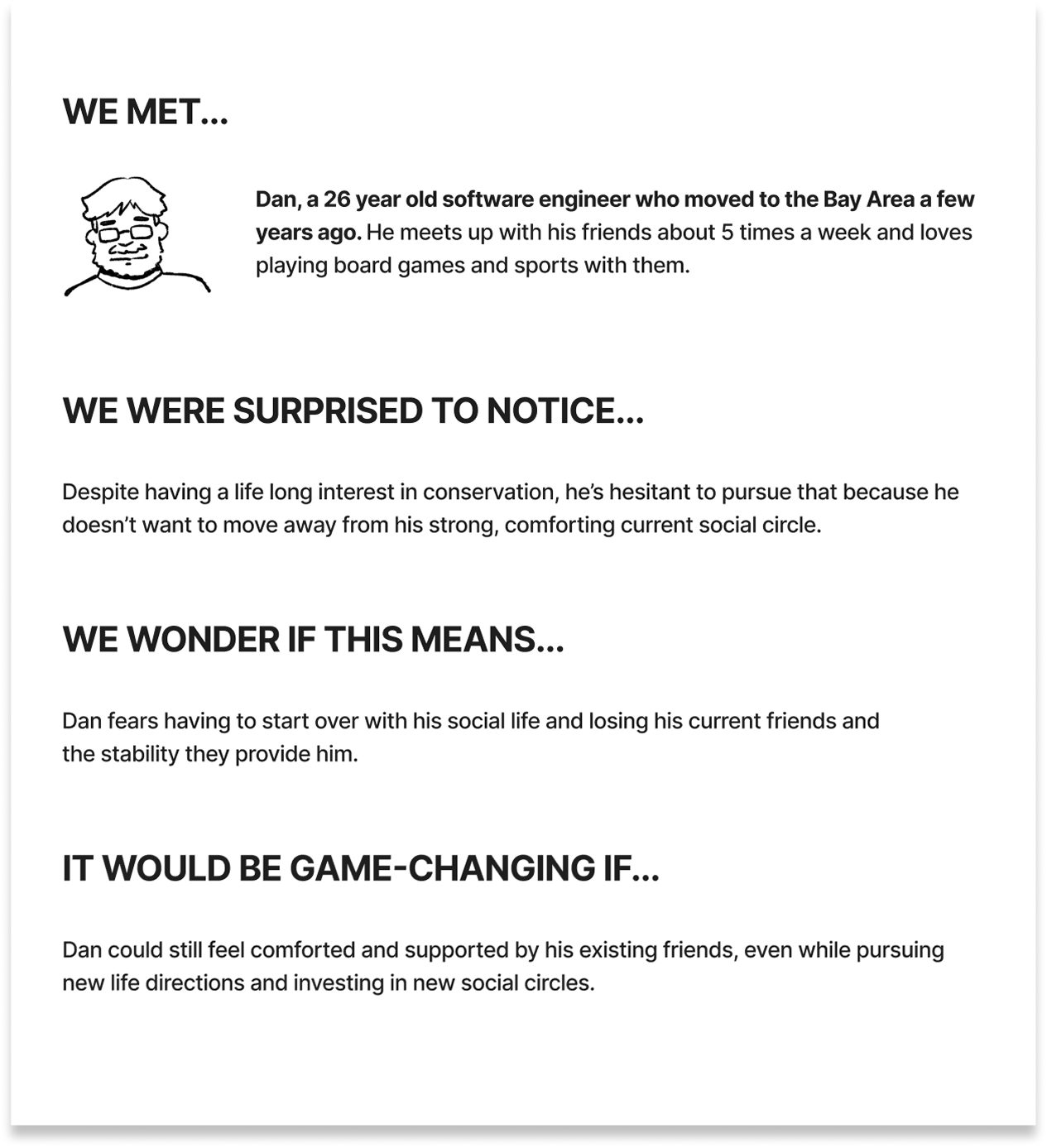
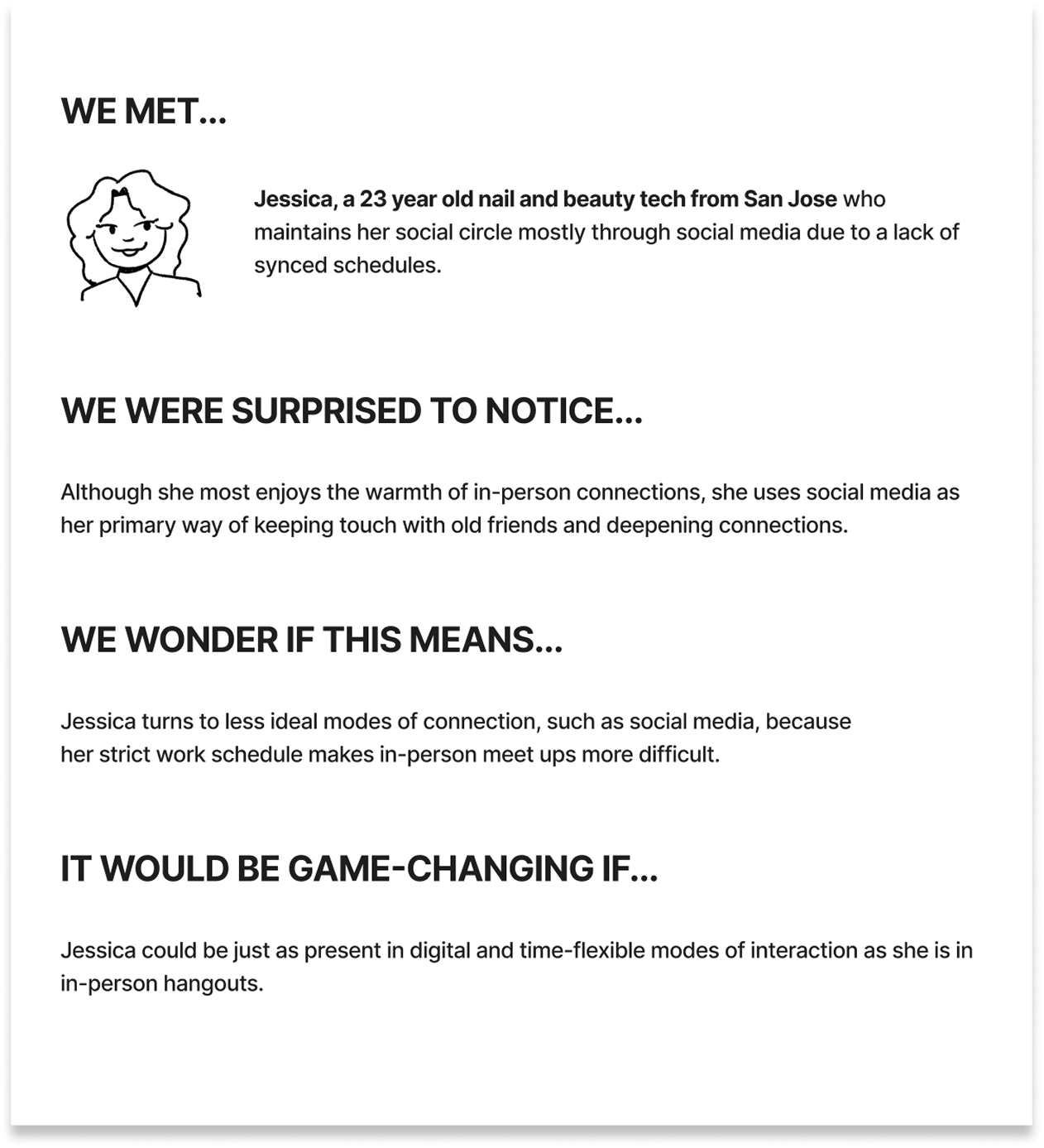
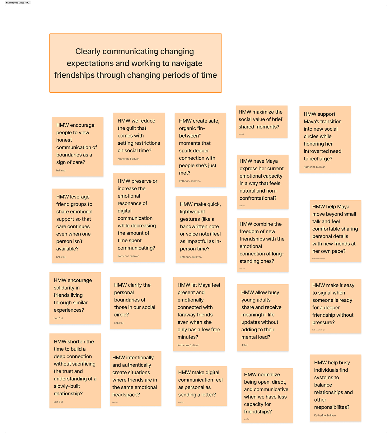
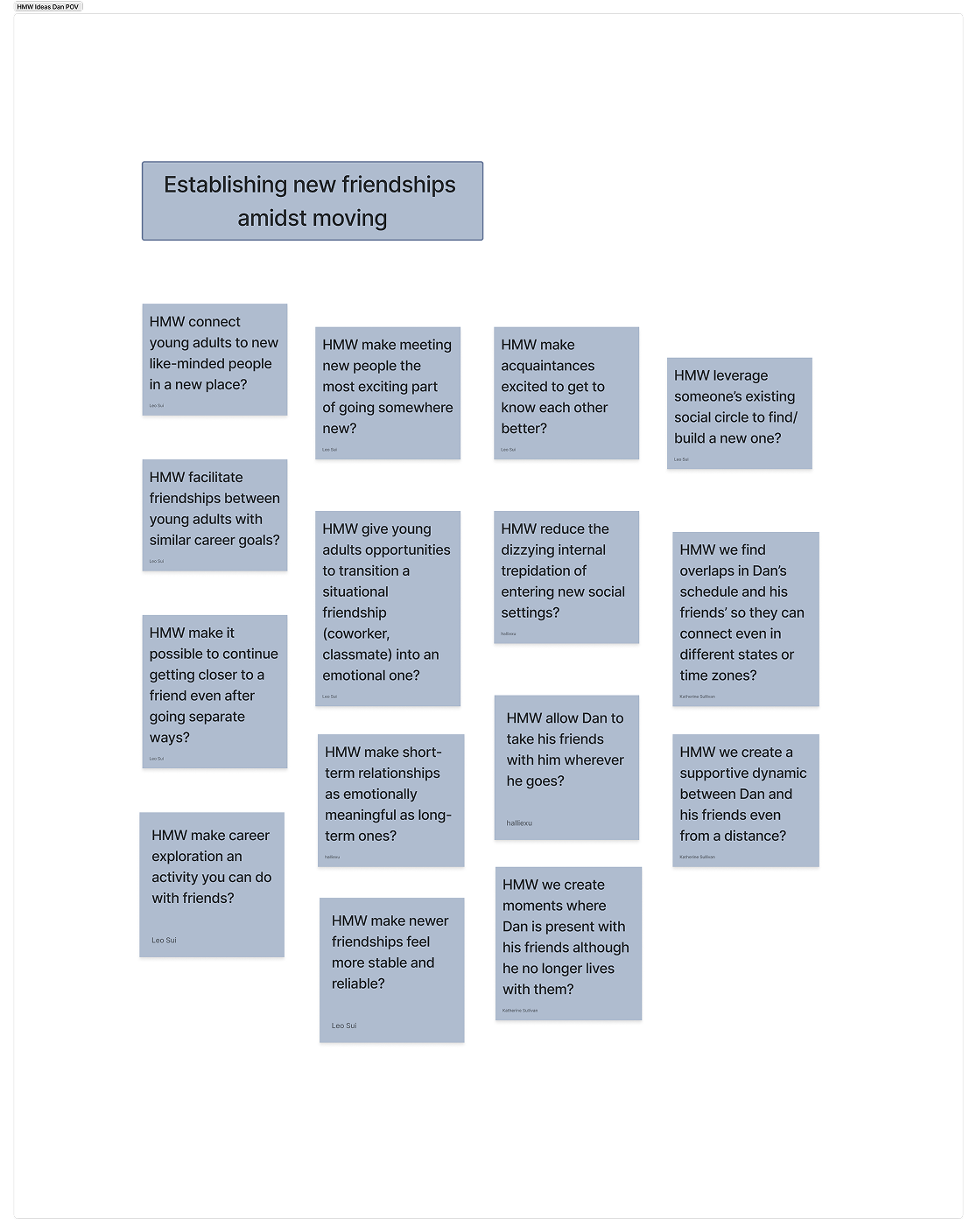
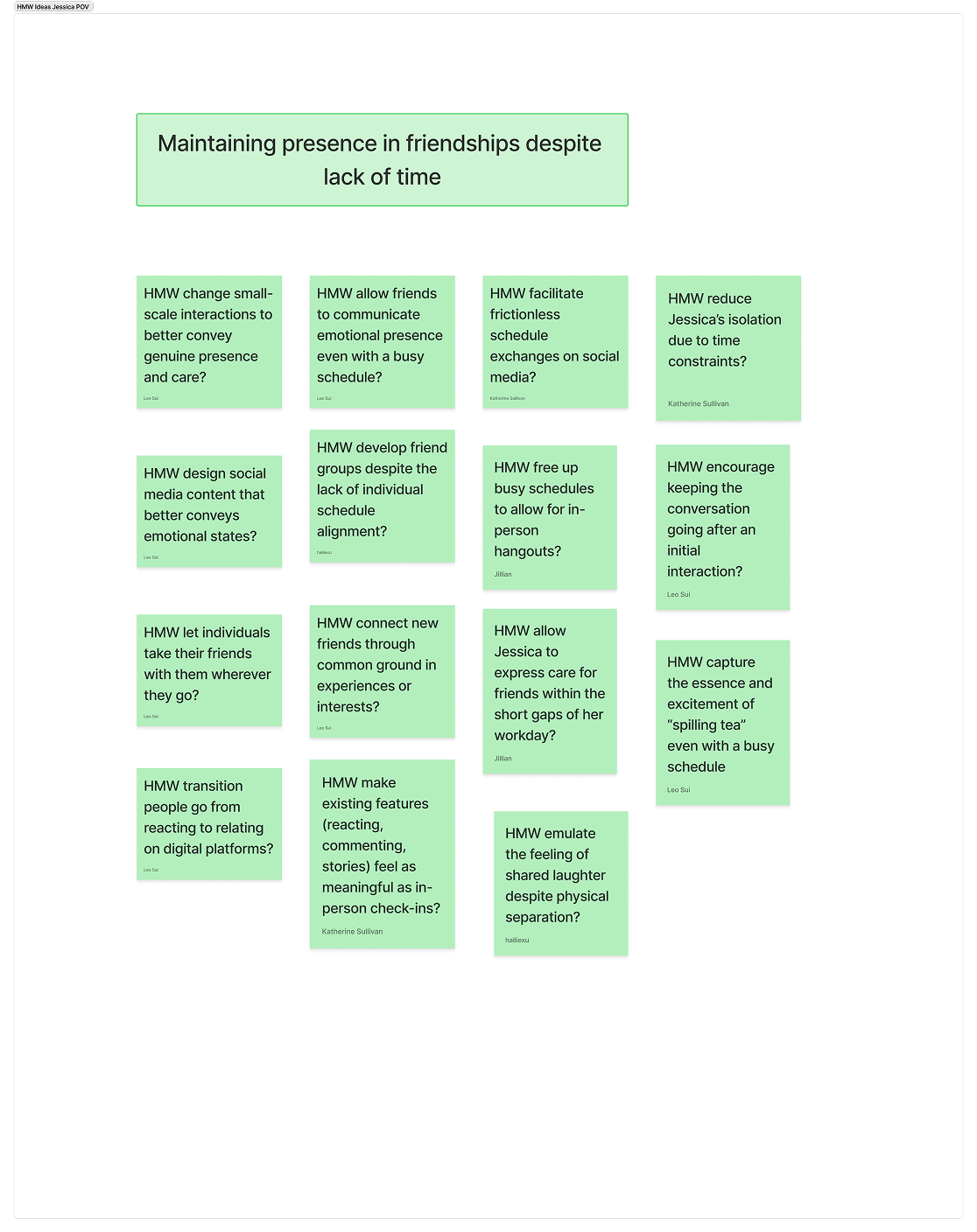
We synthesized our findings into three POV statements for composite users.
For each of these POVs we freely ideated on potential how-might-we statements, eventually narrowing down 52 options to one.
%201.png)
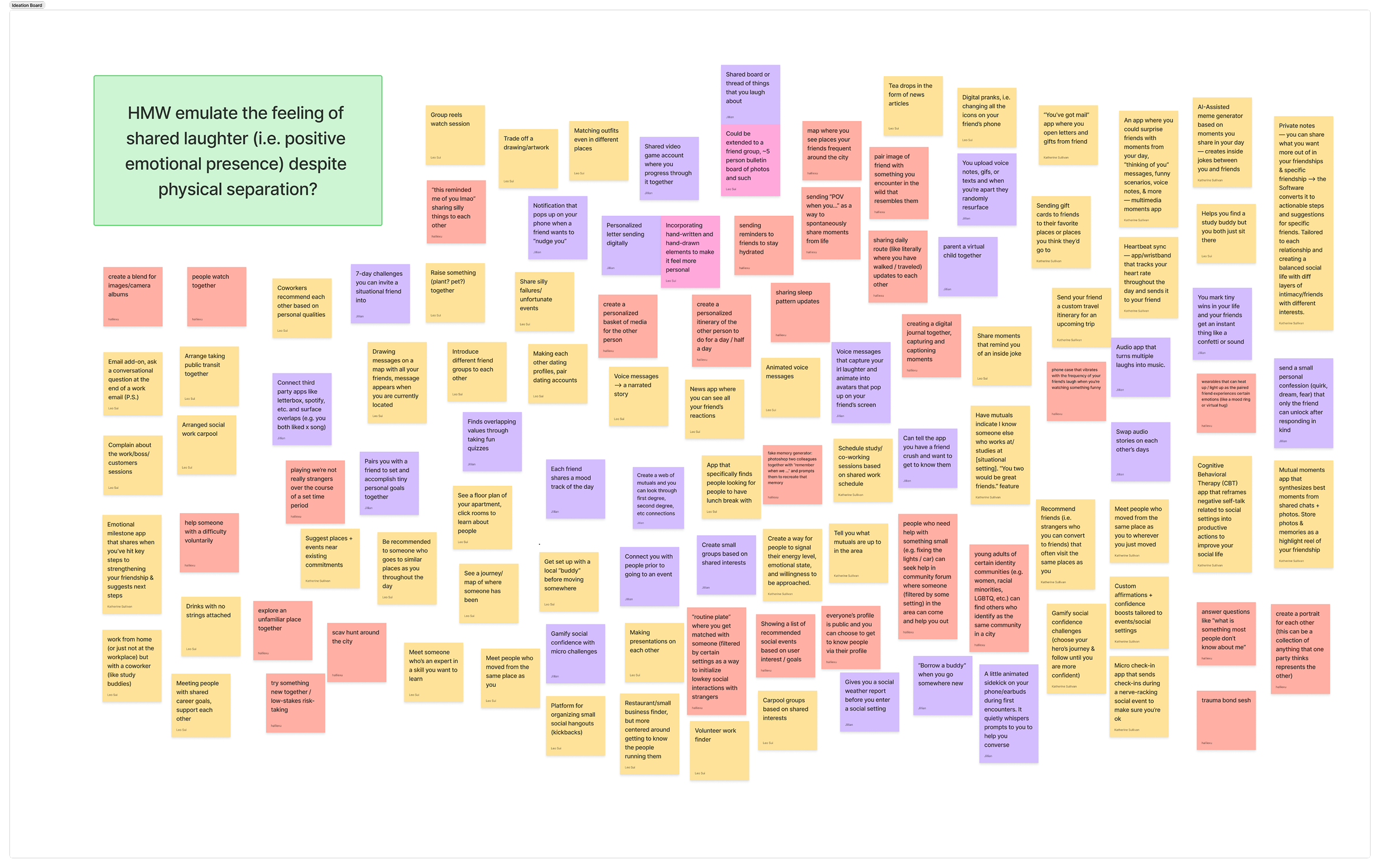
How might we emulate the feeling of shared laughter and joy despite physical separation?
The next step was ideating solutions around this HMW statement. From around 105 ideas, we narrowed down to just two we felt aligned with user needs the strongest:
1.
Digital Letters
Creating a customized digital letter with options to illustrate or hand-write, and sending it to your friend with a real delay
2.
Digital Pranks
Recreate the feeling of banter digitally. Harmless and spontaneous pranks – like a wave of stickers or changing all the icons – sent to your friend’s phone, no matter what they’re doing on it.
CONCEPT TESTING
For both of these directions, we designed and ran concept tests to test key assumptions.
1. Digital Letters
Assumption to test: receiving an unexpected digital prank would be seen as humorous, and not annoying.
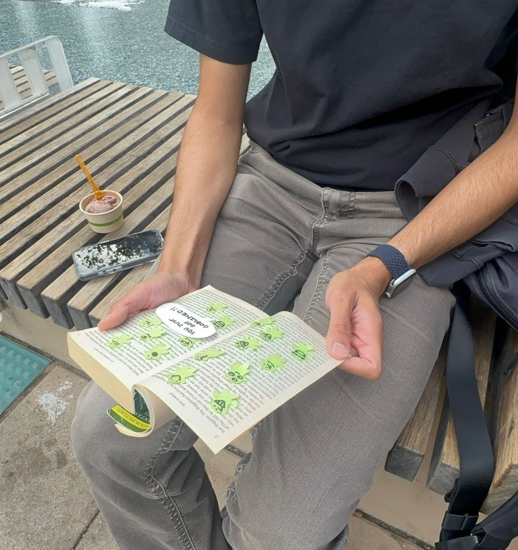
The test: Participants are given a copy of The Hobbit and must read the first 5 pages. On the third and fourth pages are numerous goblin stickers that obscure the text, requiring them to be removed one by one. We observe the participant’s reaction and debrief about their experience afterward.
What worked:
1. All users audibly laughed upon seeing the prank, and all found it more entertaining than annoying, as long as it came from a friend.
2. In many of the participants, the test resurfaced nostalgic memories of banter with their siblings or friends (“...this is definitely something my little brother would have done”).
What didn’t:
There was some concern that a digital prank that could happen outside the app could be distracting if they were working on something urgent or high-stakes.
2. Digital Pranks
Assumption to test: receiving a digital letter carries the same message of care as a physical one
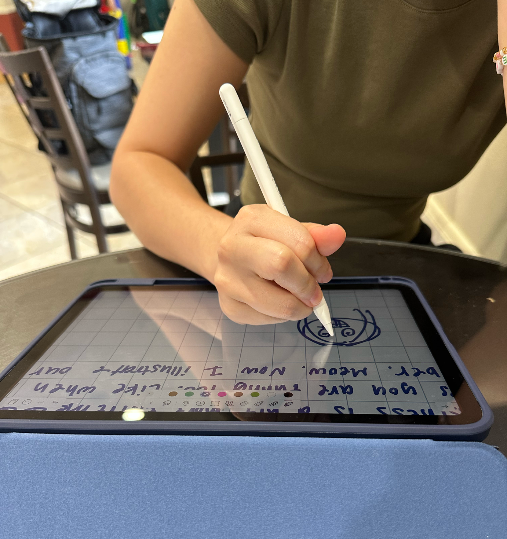
The test: Involves a “sender” participant and a “receiver” participant. The sender spends 5 minutes writing a digital letter, and then we forward it to the receiver. Reactions of both the sender and receiver are observed and both are debriefed on their experience afterward.
What worked:
1. Senders felt handwritten digital notes had far more personalization potential than just typing.
2. Every sender incorporated some kind of illustration into their letter.Recipients, without prompting, all expressed a strong desire to send a letter in reciprocation.
What didn’t:
When asked how often they would send a digital letter, most participants responded around once per month. This implied that even though it was just as meaningful as a physical letter, sending a letter digitally was still a time-consuming and unrealistic process.
Unfortunately, further research showed that a digital prank appearing outside the app was technologically infeasible, and digital letters was already a well-explored product space. Thus, we combined the spontaneity of digital pranks with the personalized communication of digital letters to create WAYN’s final concept.
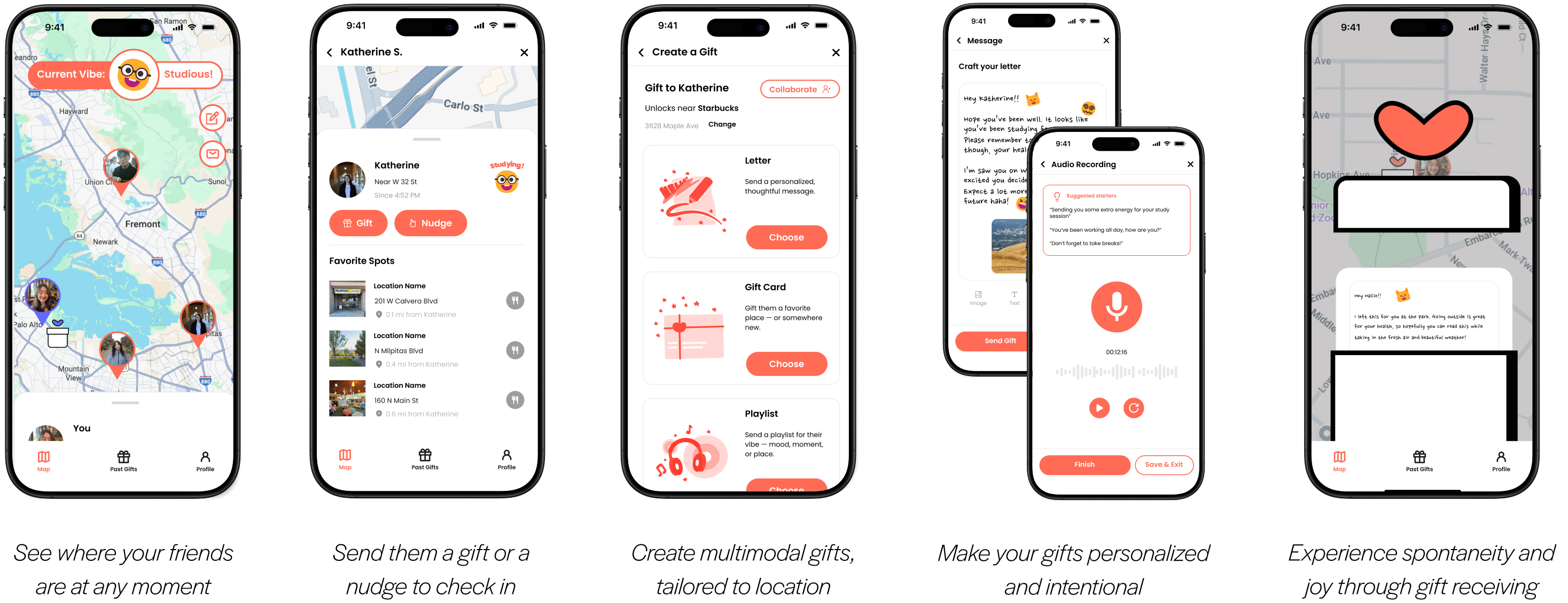
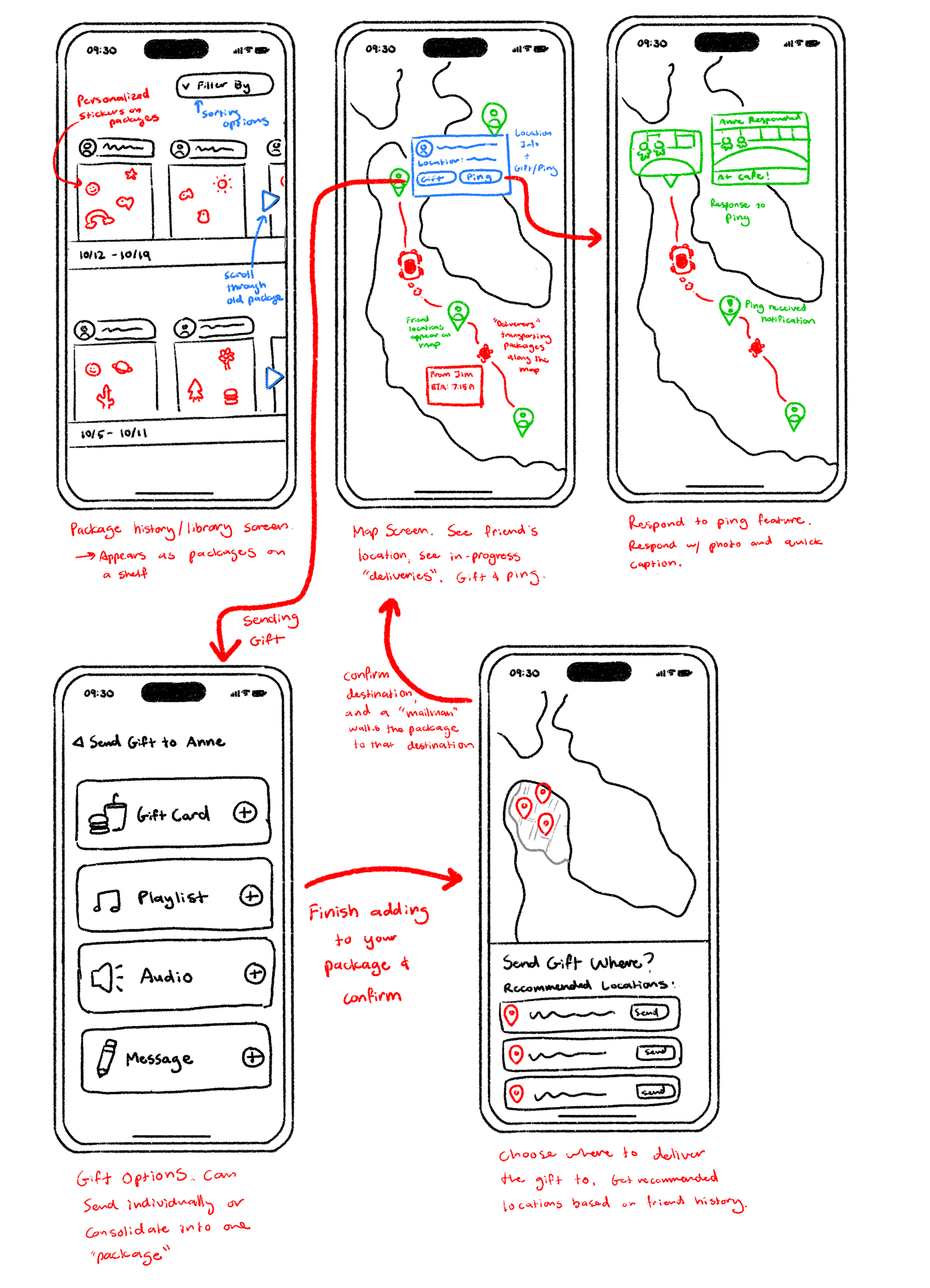
The idea is a map-based app where you can send friends multimodal digital gifts tailored to location.
You can tailor a gift to their current location (for example, sending a study playlist if you see them in a library), or you can send a gift to be unlocked at a specific location (maybe a poem you wrote that you want them to read on a beach).
LOW-FI PROTOTYPING
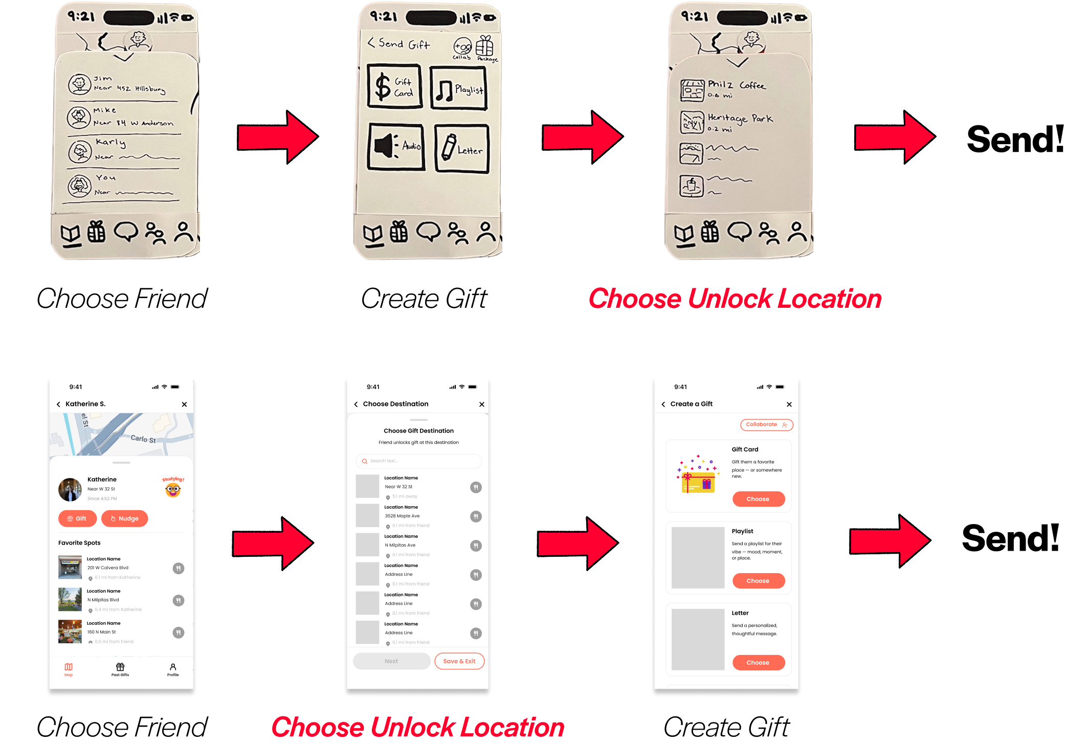
To revise our user flow, I designed a modular paper prototype to run initial usability tests.
Research shows that due to the rougher nature of paper prototypes, users feel more comfortable giving honest and critical feedback. Additionally, we designed the paper prototype to be modular, with loose moving parts we could easily swap out as needed in between testing sessions.
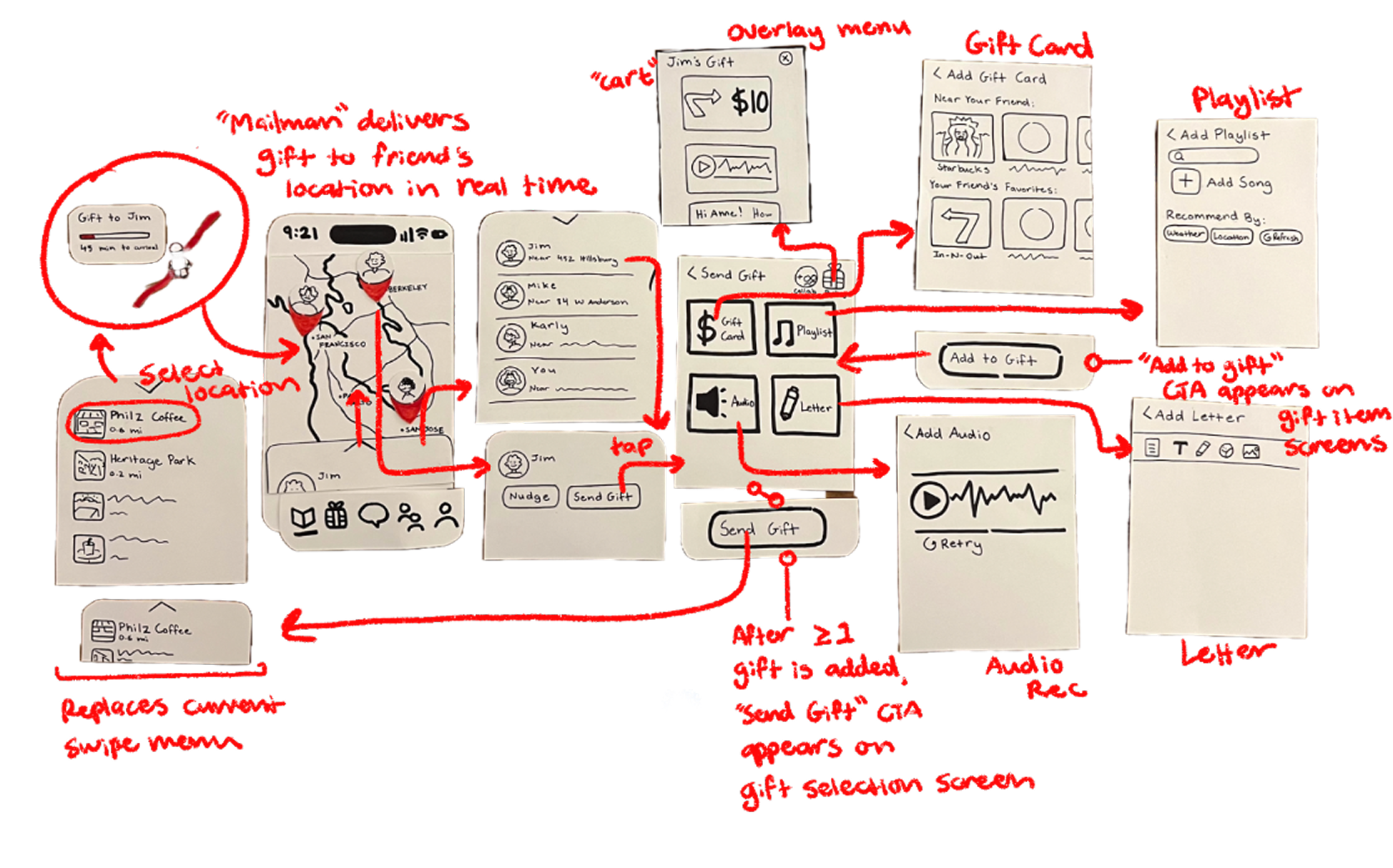
The bulk of confusion and misclicks came from the location based aspect of the gifts.
Since you set the location of the gift AFTER you make it, it’s unclear that you’re supposed to have a location in mind as you’re making the gifts.
Thus, the biggest change we made was having location selection come BEFORE gift customization. On the technical side, this would also allow us to give gift recommendations based on the selected location when we got to implementation.
DESIGN SYSTEM & FIGMA PROTOTYPE
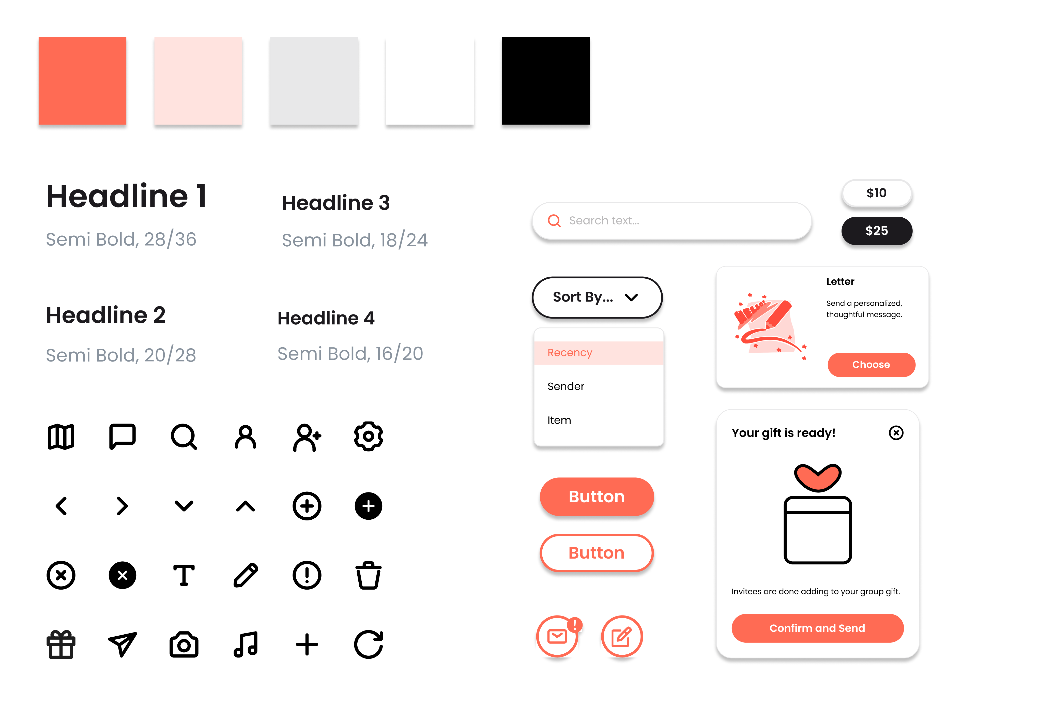
The next stage was solidifying the look and feel of the app. I started out by creating a design system containing essential components and guidelines on type, color, layout, and interaction.
I designed and wired the screens our three major task flows: sending a friend a “nudge,” sending a gift, and sending a collaborative gift. Here’s a condensed version of the gift sending flow.
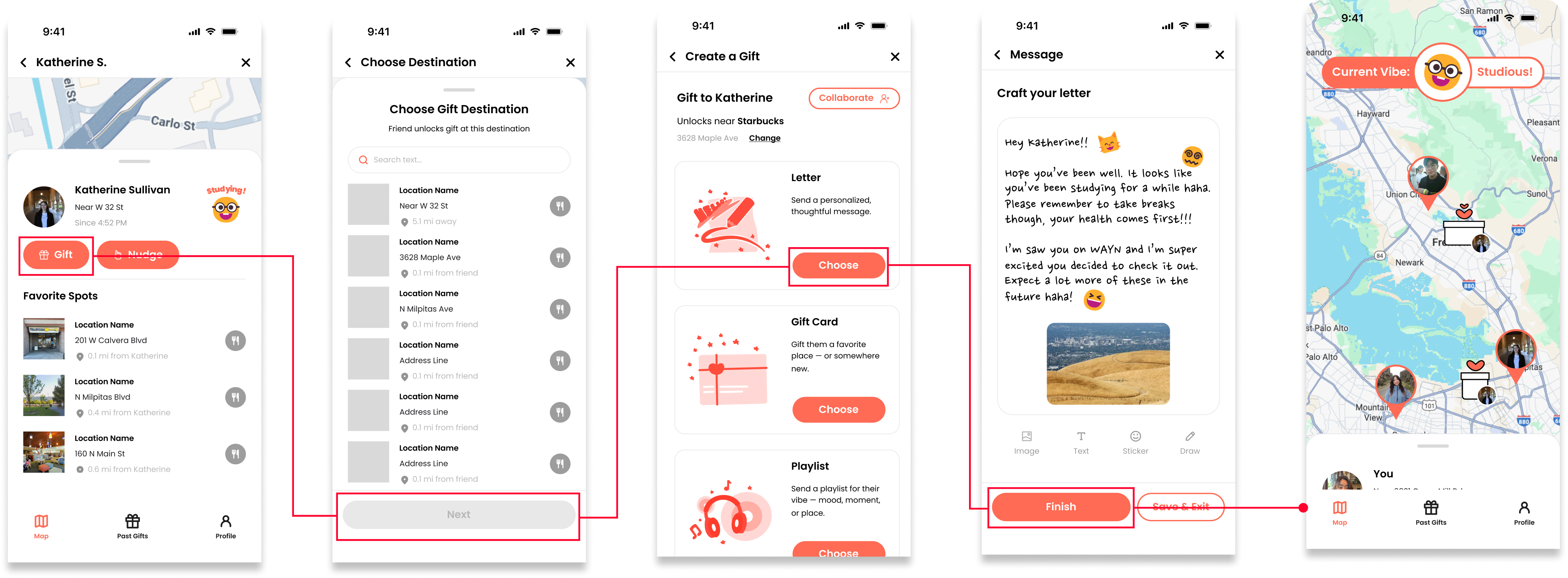
I also designed an animated logo. My brainstorming process consisted of trying to find a way to express both location and gift-giving.
The final logo captures this with some animation tricks. I think it communicates the vibe and features of the app quite well!

USABILITY TESTING
We had 3 UX experts each complete our three task flows and perform a heuristic evaluation of our app, ranking each one in severity from 1 (minor) to 4 (critical).In total, we addressed 29 violations, dramatically improving the usability of our app.
Here’s some examples of the types of changes we made.
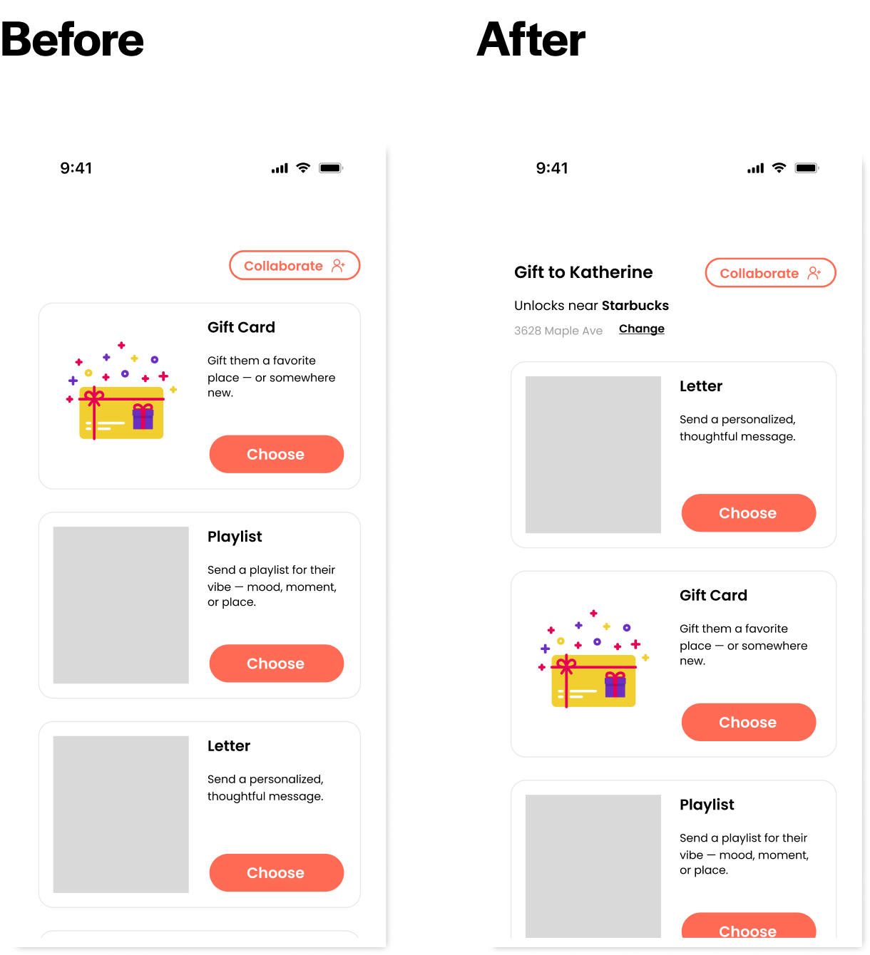
Adding Recipient/Location Info to Gift Creation:
Considering that gifts need to be personalized to the recipient and location, it’s likely a user would need to refer back to this info while making a gift.
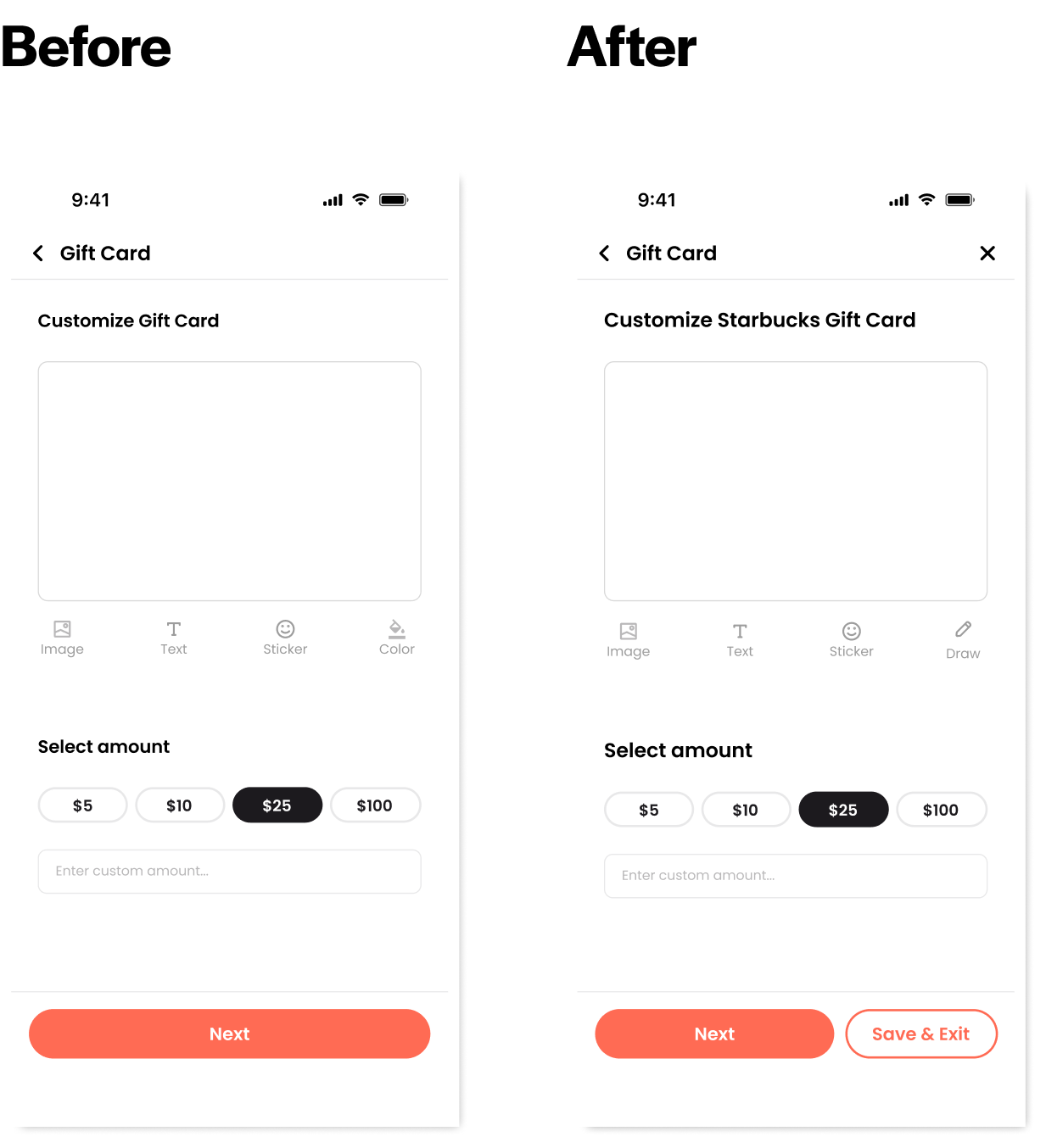
Adding “Save and Exit” Option to Gift Creation:
Gift creation has many steps, so a user may want to exit the gift making process without losing their progress.
IMPLEMENTATION
My team and I were able to implement a high-fidelity prototype in React Native with all major features fully functional.
I implemented the networking required for sending nudges and gifts, Google Maps API integration for the “Navigate to Gift” feature, gift card customization, and a handful of smaller features and visual work.
Download the Expo Go app and scan the QR code here to try it out! I recommend scanning with two devices and choosing two different users so you can try sending nudges and gifts to yourself.
We concluded this project by competing against other student teams who were taking this class. Out of 23 teams, our project received the award for Most Innovative app for its creative use of location as a relationship builder.

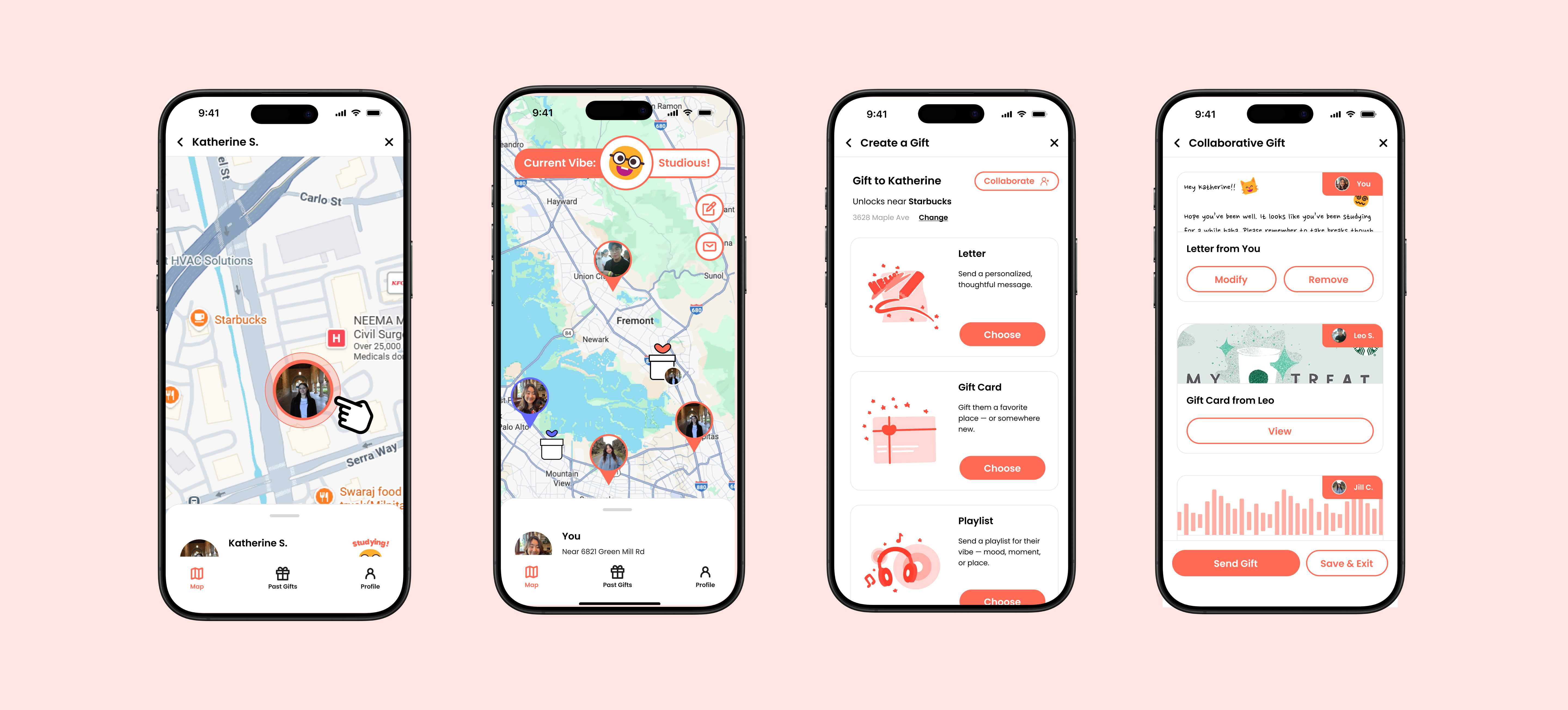
%201.png)