Buy&Ship Product Strategy Internship
Designing solutions for shopping discovery.
ROLE
Product Manager
Product Designer
TIMELINE
Jun 2025 - Aug 2025
Product Strategy
UI/UX Design
User Research
SUMMARY
I led the design and development of two major projects for the Buyandship platform: a trending merchants feature to streamline brand discovery and a full redesign of community posts. To ground the work in user needs, I conducted 27 interviews and paired those qualitative findings with platform data to reframe problem statements, map user journeys, and surface key pain points. Prototyping and iteration in Figma were supported by design critiques, close collaboration with PMs and engineers, and validation through A/B testing.
WHAT'S BUY&SHIP?
Buyandship is a Hong Kong–based cross-border e-commerce platform founded in 2014. The company offers two main services: parcel forwarding, which lets users ship purchases from overseas merchants to Buyandship’s international warehouses for affordable, consolidated delivery, and proxy shopping, which enables customers to purchase items directly through Buyandship when merchants don’t support international payment or shipping.
Project 1: Trending Merchants
THE PROBLEM
For Buyandship users, the number of items ordered per session is just about 1. While this isn’t bad, it undercuts a major value proposition of the platform: consolidating multiple orders into a single shipment. In other words, one of our core features wasn’t being fully utilized. Management proposed that this is because “users don’t know what else to buy”: they can’t find products of interest beyond their primary intent.
USER RESEARCH
Before proceeding, I decided to validate this hypothesis by holding 12 user interviews to learn about their shopping behaviors. Synthesizing these insights, I formulated a user persona and user journey.

Michael, 28
Hobbyist Collector
GOALS
Buy confidently, secure the best deals, and shop smart.
PAIN POINTS
Distrusts recommendations and wastes time comparing merchants.
OPPORTUNITIES
Trends, community insights, and price comparisons simplify decisions.
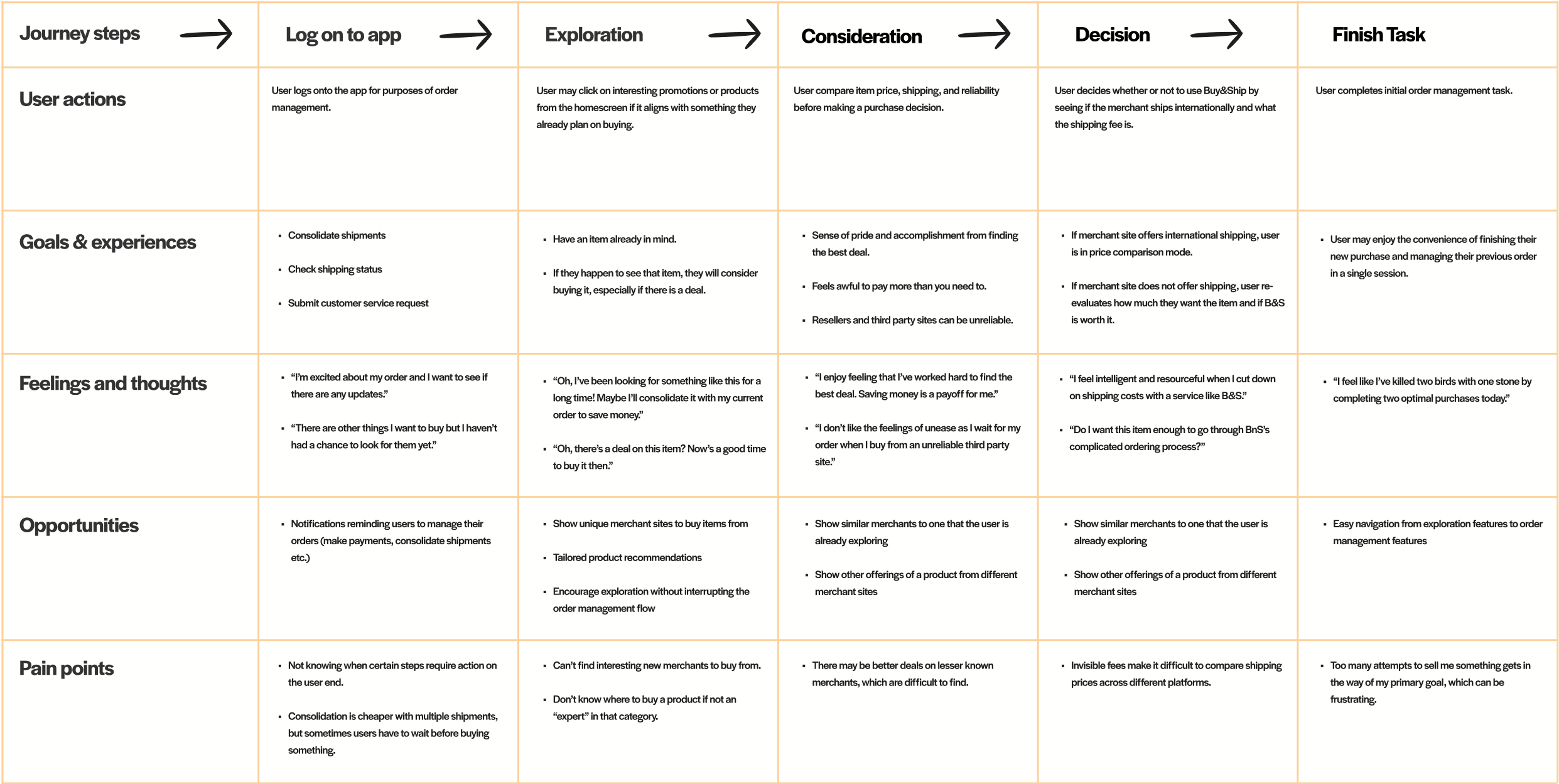
Essentially, Buy&Ship users are analytical price optimizers, not impulsive buyers. They are goal-oriented and are not easily distracted by product recommendations. Thus, the core problem was not “users don’t know what else to buy.”
Users know exactly what they want to buy, but not the best place (i.e. which merchant site) to buy it.
With input from management and the engineering team, I proposed building a trending merchants feature with the goal of showing shoppers new brands and shopping sites from around the world to buy from.
To guide my ideation, I defined two non-negotiable criteria the feature must meet:
1.
The trending metric must treat large and small merchants equally.
Since the goal is merchant discovery, there has to regularly be fresh and exciting hidden-gem merchants.
2.
The user flow must guide the user to submit a proxy item request.
In other words, after discovering a new merchant, the user has to be encouraged to actually order from that merchant through Buy&Ship.
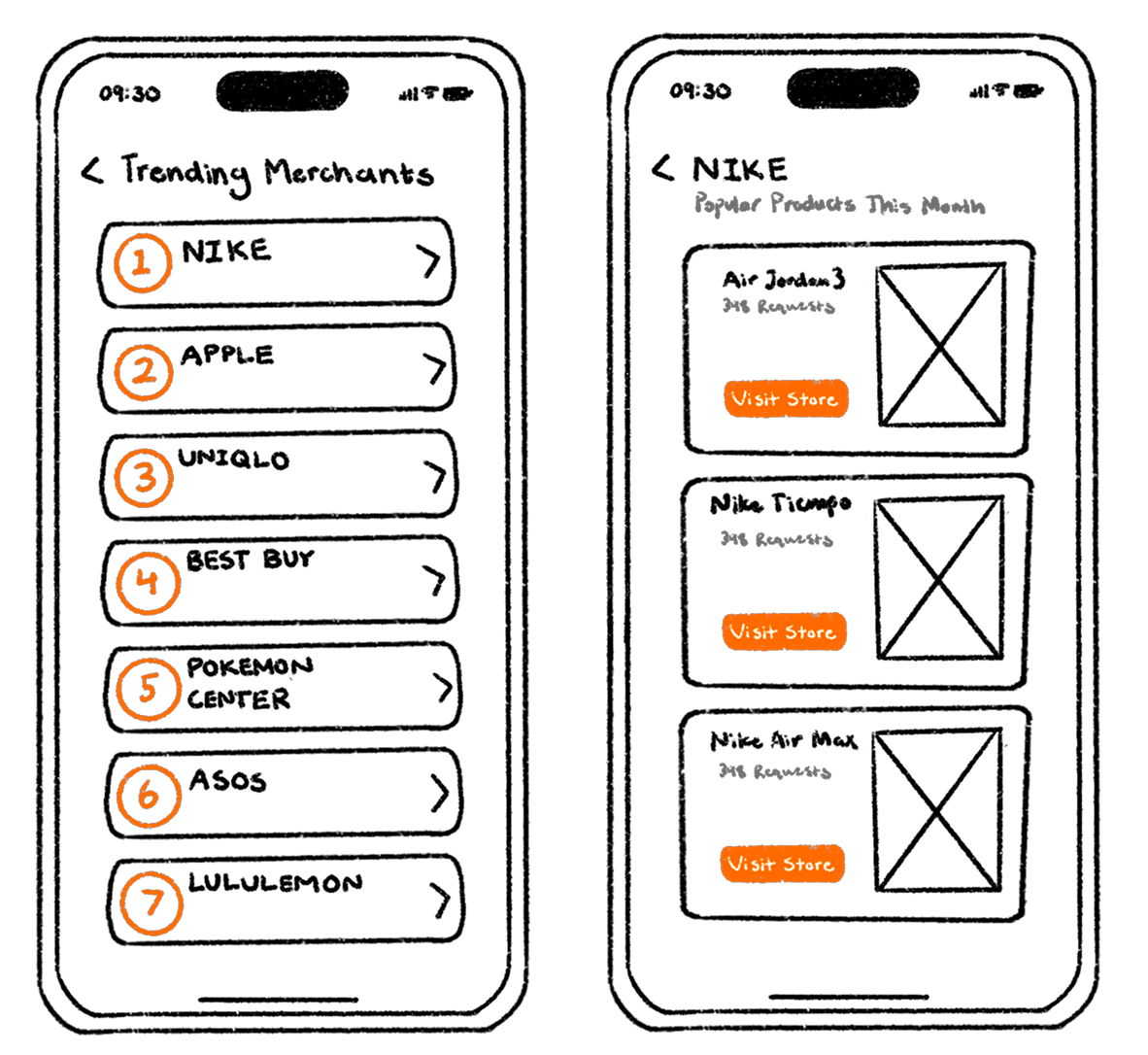
THE TRENDING METRIC
Now, the big question: how do we quantify how “trendy” a merchant is? Using real purchase data from the past 6 months, I experimented with different metrics to see which would yield the best results.
First, I tested metrics based on absolute order counts. I tested ranking merchants based on raw number of orders per week and raw weekly order increases.
However, I quickly realized that any metric based on absolute order counts would unfairly favor larger merchants and fail to capture actual shifts in popularity.
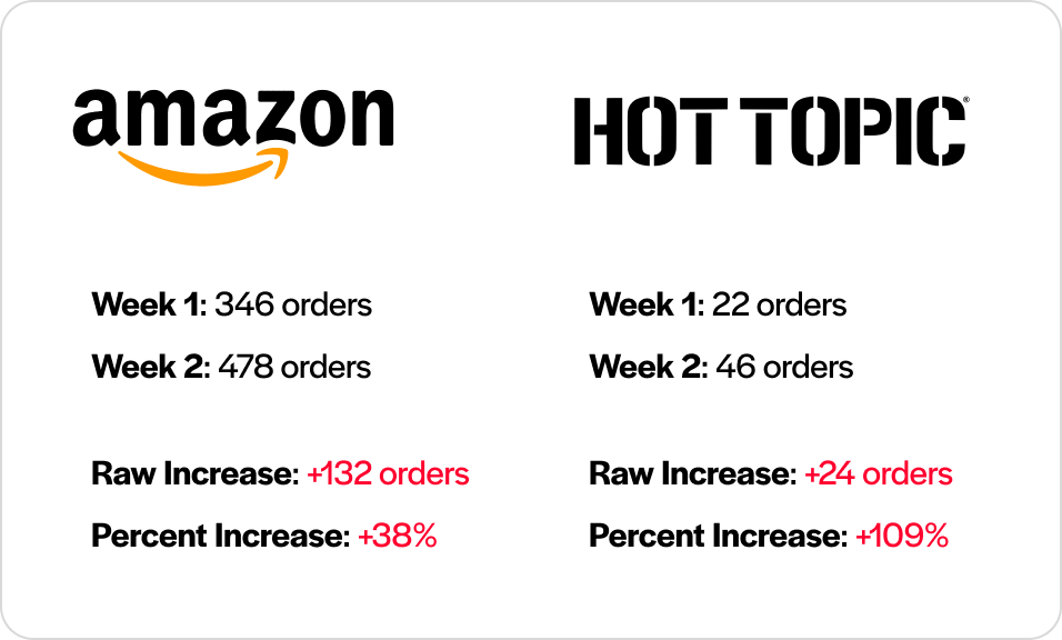
.png)
To address this problem, I decided I would have to use a percent change metric rather than an absolute change metric.
After much trial and error, I found that measuring each week’s order volume as a percent change from the historical average produced the most reliable results.
This metric now satisfies my key criteria:

Answers the question “is this merchant more popular than usual?” instead of “is this merchant more popular than last week?” which is more useful to users.
Consistently surfaces smaller or lesser-known brands, promoting merchant discovery.
FROM DISCOVERY TO ACTION
While users could now discover new merchants to shop from, I still needed a way to encourage them to place item requests from these merchants through Buy&Ship.
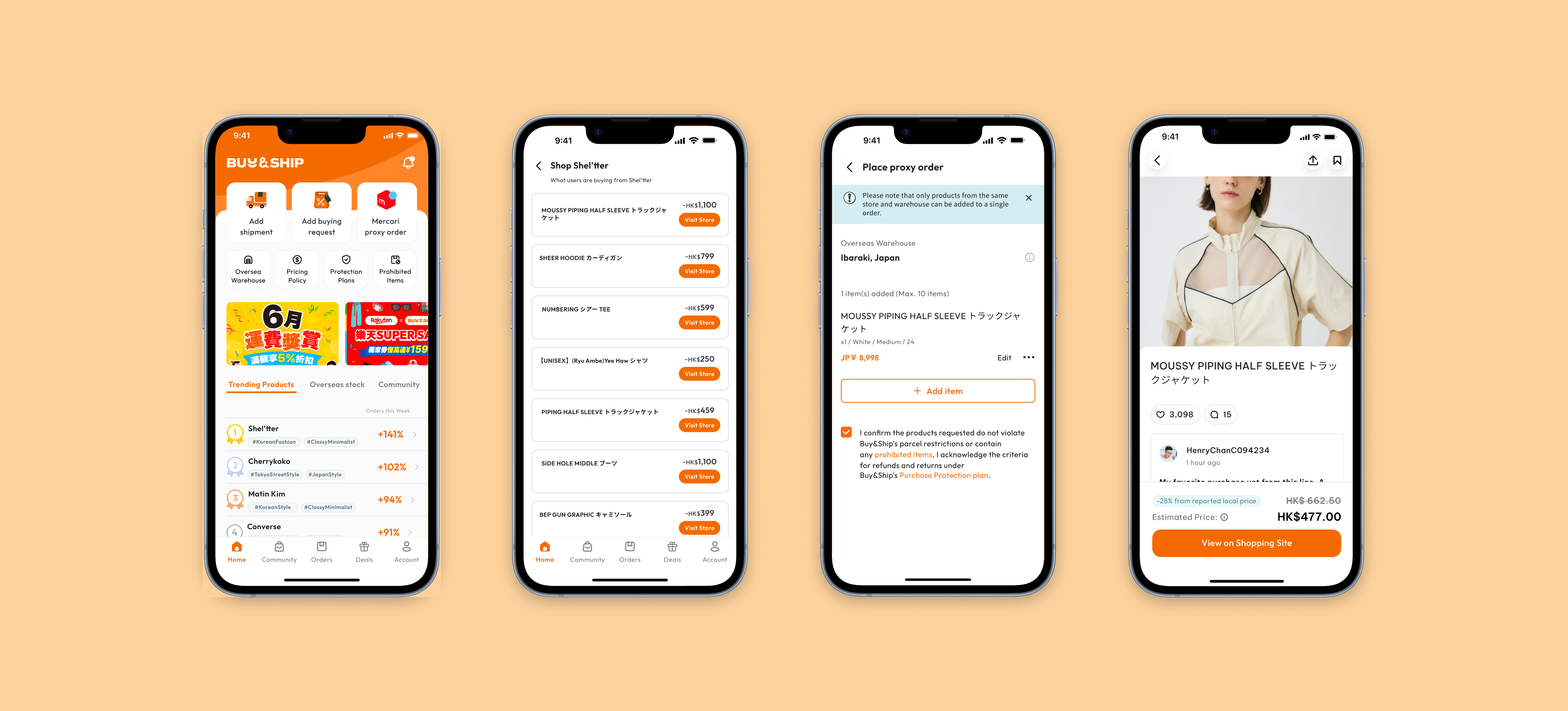
My solution: opening merchant sites in an in-app browser. With this, I could add our “Request Item” CTA button to product listings on these merchant sites, which autofills the item request form for a seamless purchasing experience. Users can explore different items on the merchant site without ever leaving our ecosystem.

ITERATION
A critical problem emerged in our design critiques. If our goal is to surface unfamiliar merchants, there’s a good chance the user will have no context on what the merchant sells which can make exploration aimless and frustrating.
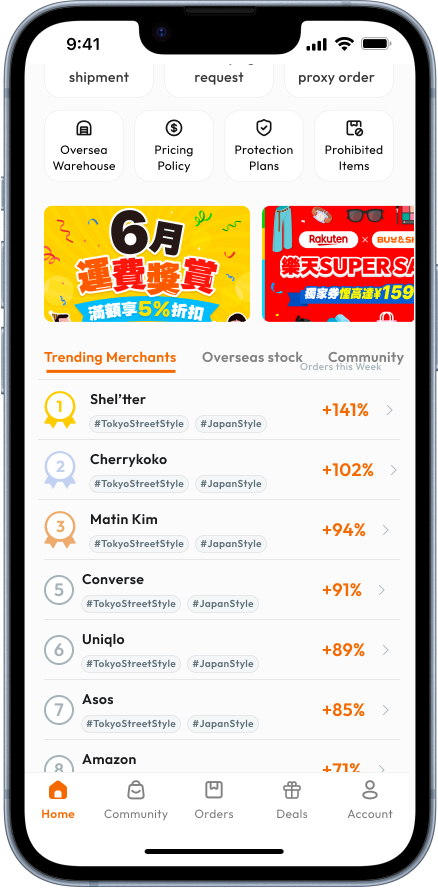
To handle this, I included two AI-generated hashtags for each merchant to provide necessary background information on where a merchant is based and their general product offerings.
I collaborated closely with our data engineers to fine-tune the script, ensuring the hashtags were both accurate and reliable.
At this stage, I also made the list more visually exciting by differentiating the top 3 merchants.
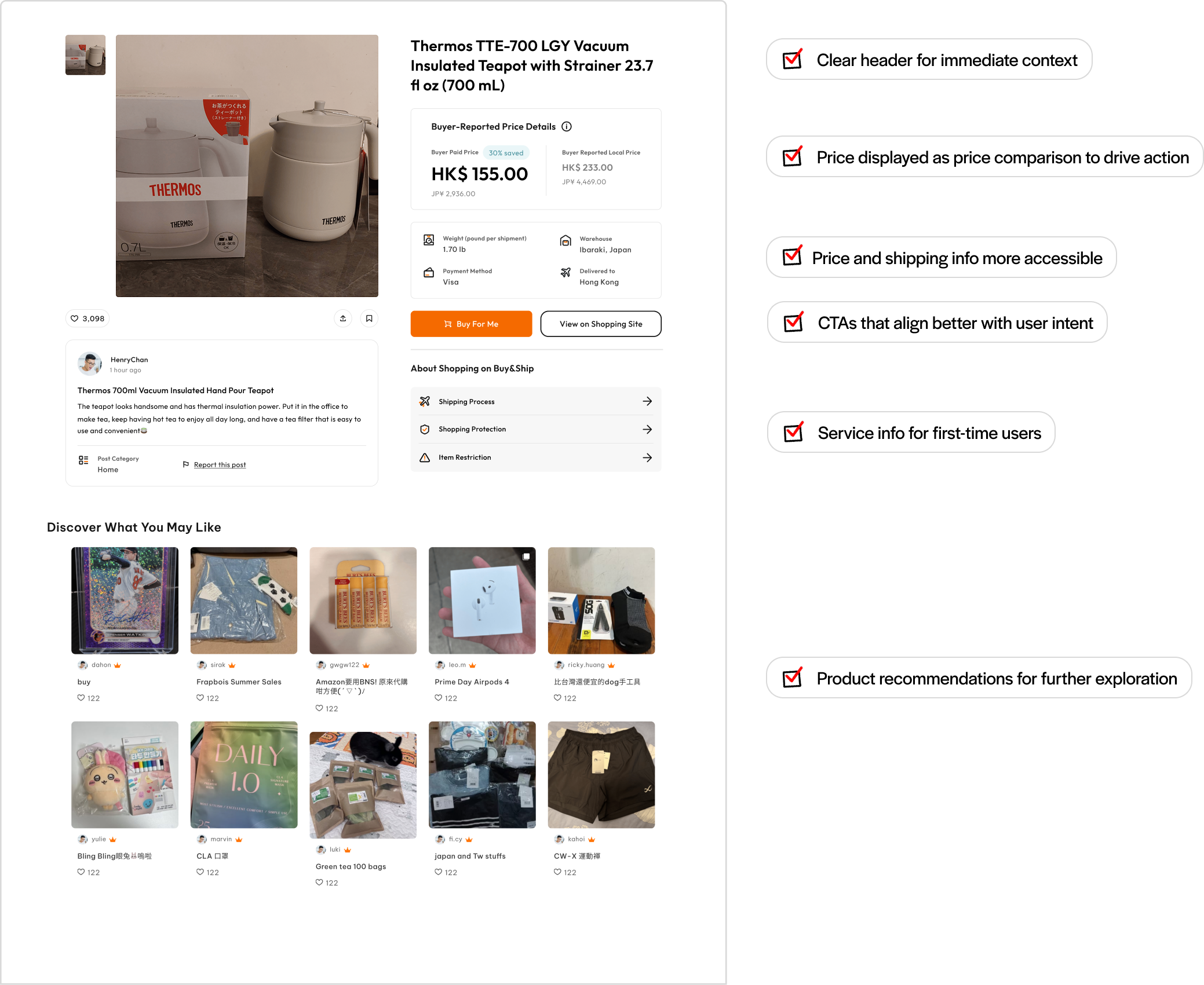
FINAL DESIGN
With that, let’s take a look at the final design and how the features designed thus far work together.

NEXT STEPS
You may have noticed a critical issue at the exploration step: where are the product images? Although users highlighted the importance of images, it was beyond the scope of this MVP. Since these are listings from external merchant sites, we would have to develop a method to scrape images from those pages, which was not feasible with our current resources. I made clear in my documentation that in future phases of this feature, images are a must-have.


Project 2: Community Post Redesign
BACKGROUND
The second half of my internship with Buy&Ship was dedicated to redesigning our community posts.
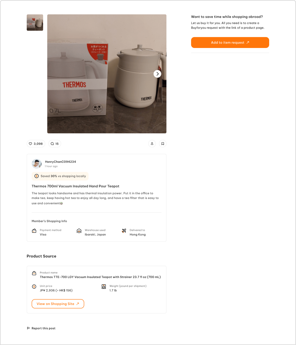
Community posts are created by users to share the items they’ve purchased through our platform. Viewers are able to submit a proxy request for these items via “Add to Item Request” or view the original merchant site via “View on Shopping Site.”
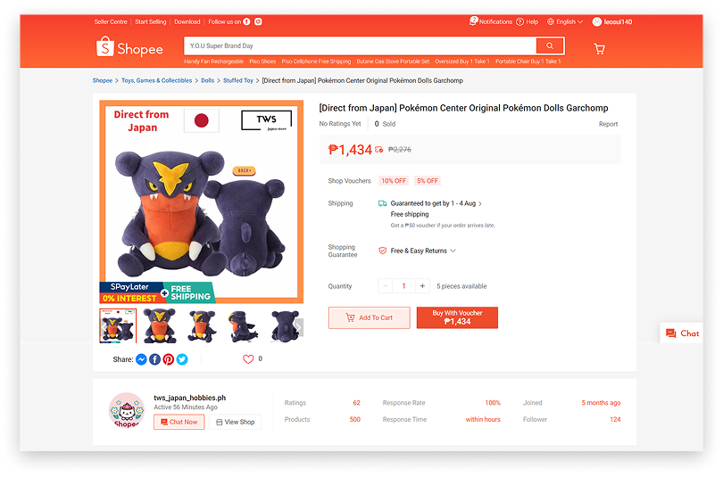
Here’s a look at the original version.
THE PROBLEM
The purpose of community posts is to encourage shoppers to submit proxy requests via the primary CTA. However, community posts are quite bad at their job, with only a 0.5% conversion rate. My goal with this redesign was to boost the CVR from 0.5% to 5%.
DATA ANALYSIS & RESEARCH
First, I wanted to understand how users were currently interacting with community posts by analyzing button click data.
Doing so led to a fascinating finding: By far, the most clicked button on the community posts was “View on Shopping Site,” which takes the user to the original merchant site. Our primary CTA, “Add to Item Request,” was not even close.
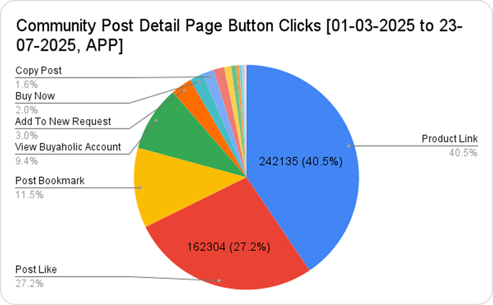
Knowing from previous user research that Buyandship users are research-driven buyers, I hypothesized that shoppers will always do further research on the merchant site before making a decision to purchase a product. If this was the case, then there would be a mismatch between user intent and our primary CTA.
I conducted 10 user interviews to validate this hypothesis and create a user journey map. I was able to conclude that users do in fact first visit the shopping site before even considering requesting an item.
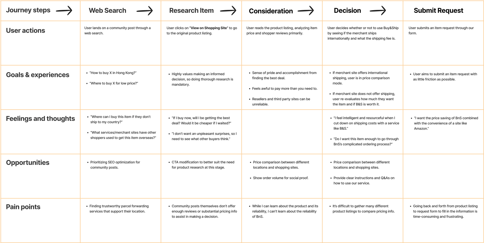
FEATURES
Due to resource constraints and to maintain consistency between new and existing community posts, I could only design with the data already available in the feature. In other words, I had to get creative with presenting our current information in new ways.
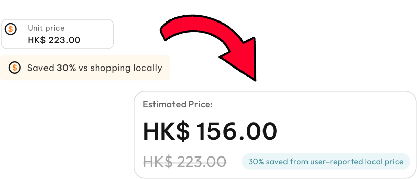
One of the key data points we had at our disposal was the purchase price, based on how much the user spent. We also had a user-reported estimate of how much they saved compared to buying locally.
By combining these two inputs, I could approximate the local price and present users with a clear price comparison.
One of the hardest choices was deciding on the primary CTA. The user intent at this stage is research, so keeping the CTA as “Add to Item Request” creates a mismatch. Changing the primary CTA to “View on Shopping Site” better aligns with that intent, but risks sending users out of our ecosystem too early, reducing conversion.
I soon realized that the answer to this conundrum was right in front all along. I could reuse the in-app browser infrastructure being developed for the trending merchant project, solving this problem without any additional resources.
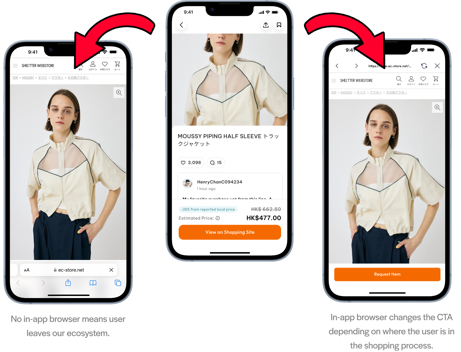
There’s no way to implement an in-app browser for the web version, so I simply made the “View on Shopping Site” CTA more accessible. The rest of the web version is modeled after established e-commerce UI conventions. Shopee, the biggest ecommerce platform in Southeast Asia, was my primary inspiration.
FEATURES
Due to resource constraints and to maintain consistency between new and existing community posts, I could only design with the data already available in the feature. In other words, I had to get creative with presenting our current information in new ways.
Overall, users found the revised version more engaging, but several issues surfaced. Because the price is user-reported, I labeled it as an “estimated price.” However, feedback showed that transparency about its source was more important, leading me to revise the title.
Users also noted that using a strikethrough for price comparison felt misleading, since it suggested a discount. To clarify, I instead displayed the two prices side by side to emphasize comparison rather than markdown.

FINAL DESIGN
With that, let’s see how everything comes together in the final design.
NEXT STEPS
Due to the data limitations of this project, much information that would likely be useful to users could not be included. For example, exact shipping price, shipping time, and more accurate price comparisons are top priorities for later phases.
TAKEAWAYS
1.
Ideating and Designing Under Tight Resource Constraints
Learned to make critical decisions on what aspects of a feature to prioritize to maximize value with minimal resources
2.
Seeing the Big Picture
Collaborating closely with management and engineering helped me balance user needs, business goals, and team constraints.
3.
Qualitative and Quantitative Data are Strongest Together
Combining quantitative data with qualitative insights helped me understand my users on a micro and macro level.